

The Best Neutral Paint Colors for Every Room in Your Home
Choosing a paint color sounds simple. It isn't.
The difference between a warm neutral and a cold one can make or break an entire room. Undertones are notoriously hard to read on a tiny paint swatch. After years of designing spaces for clients across NJ and NY, these are the neutrals I reach for again and again.
The Rule of Undertones
Before we get into specific colors, here's the single most important thing to understand about neutrals: they all have undertones. A white can pull pink, yellow, green, or blue. A greige can look purple in certain light. The undertone either works with your space or fights it.
Always test paint on the actual wall, in the actual light of your room, before committing. Lighting changes everything.
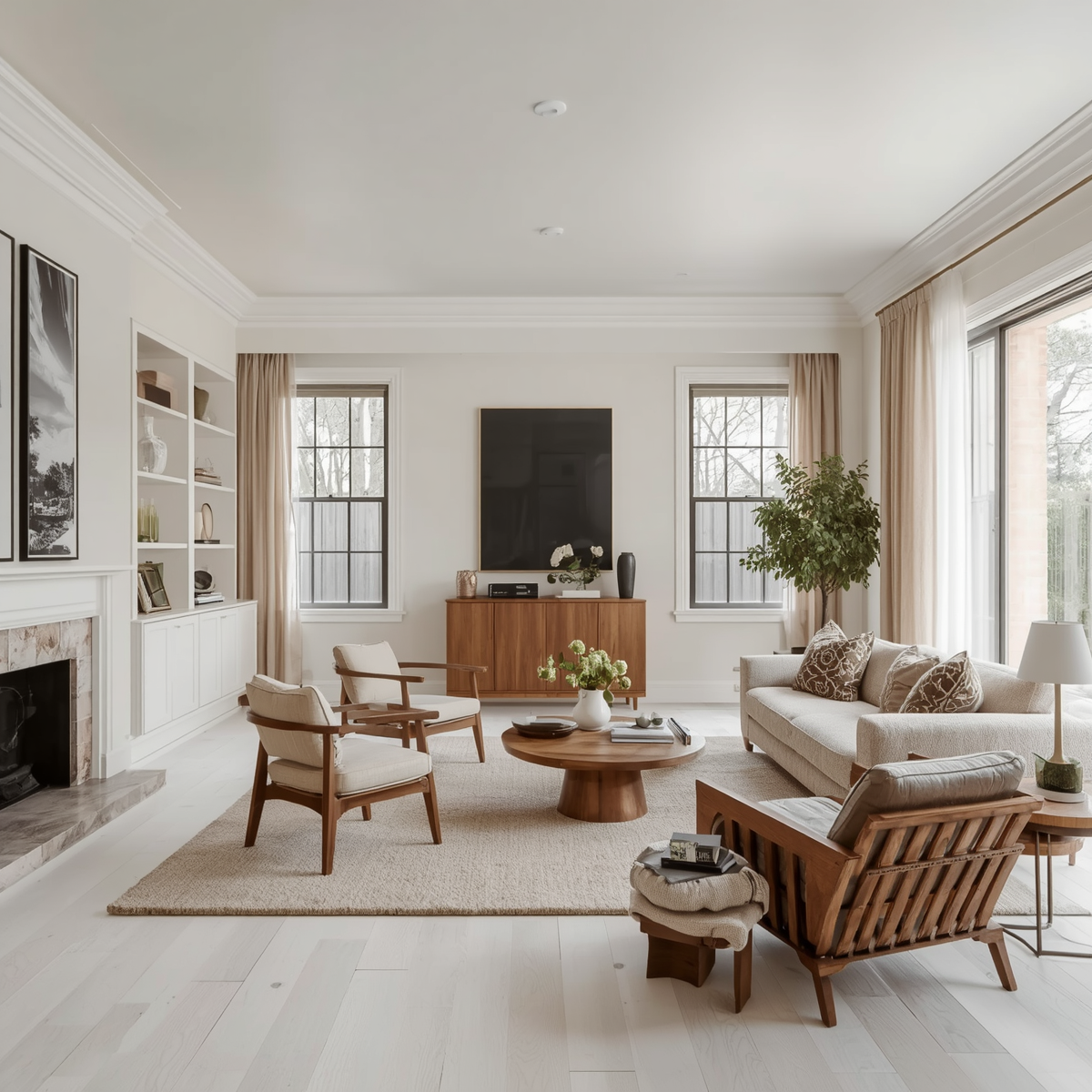
Living Room
Best pick: Benjamin Moore White Dove (OC-17)
Why it works: It's warm without being yellow, creamy without being heavy. Works in both north and south-facing rooms. One of the most universally loved whites in residential design.
Also consider: Sherwin-Williams Accessible Beige (SW 7036), Benjamin Moore Pale Oak (OC-20)
Bedroom

Best pick: Sherwin-Williams Agreeable Gray (SW 7029)
Why it works: A greige that reads warm and grounding. Calming without being cold. Works beautifully with wood tones and linen bedding.
Also consider: Benjamin Moore Sea Salt (2123-40) for a softer, spa-like feel
Kitchen
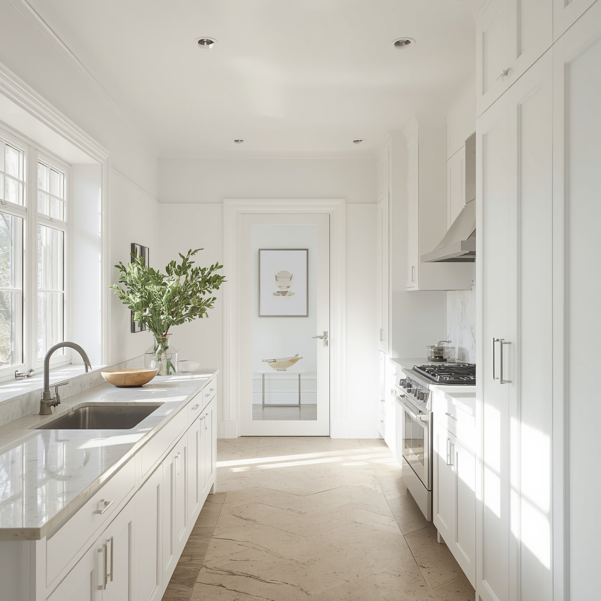
Best pick: Benjamin Moore Simply White (OC-17)
Why it works: Brighter and crisper than White Dove — great for kitchens that need light and freshness without going stark white.
Also consider: Sherwin-Williams Alabaster (SW 7008) for a warmer, slightly creamier option
Home Office
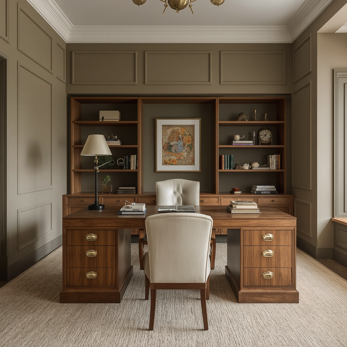
Best pick: Farrow & Ball Elephant's Breath (No. 229)
Why it works: A warm, sophisticated greige with depth. Makes a home office feel intentional and serious without being cold. Works beautifully with walnut furniture and warm metals.
Nursery or Kid's Room
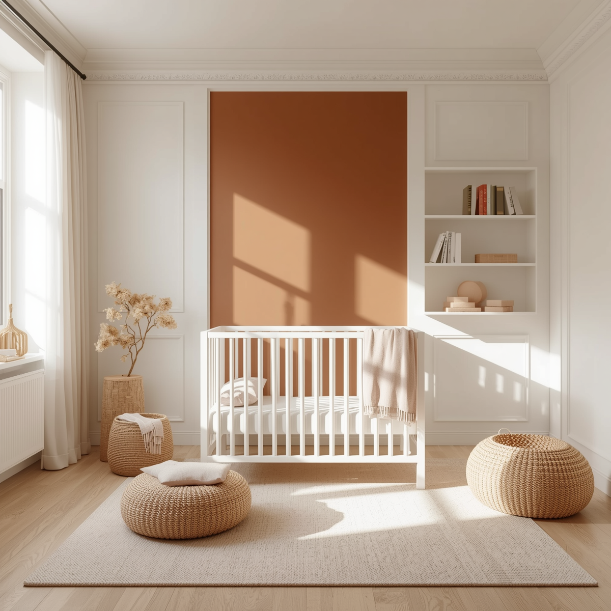
Best pick: Benjamin Moore Chantilly Lace (OC-65) with a warm accent wall
Why it works: Clean, crisp white that photographs beautifully. Pair with a warmer accent color (sage, terracotta, dusty pink) on one wall for personality.
A Note on Dark Colors
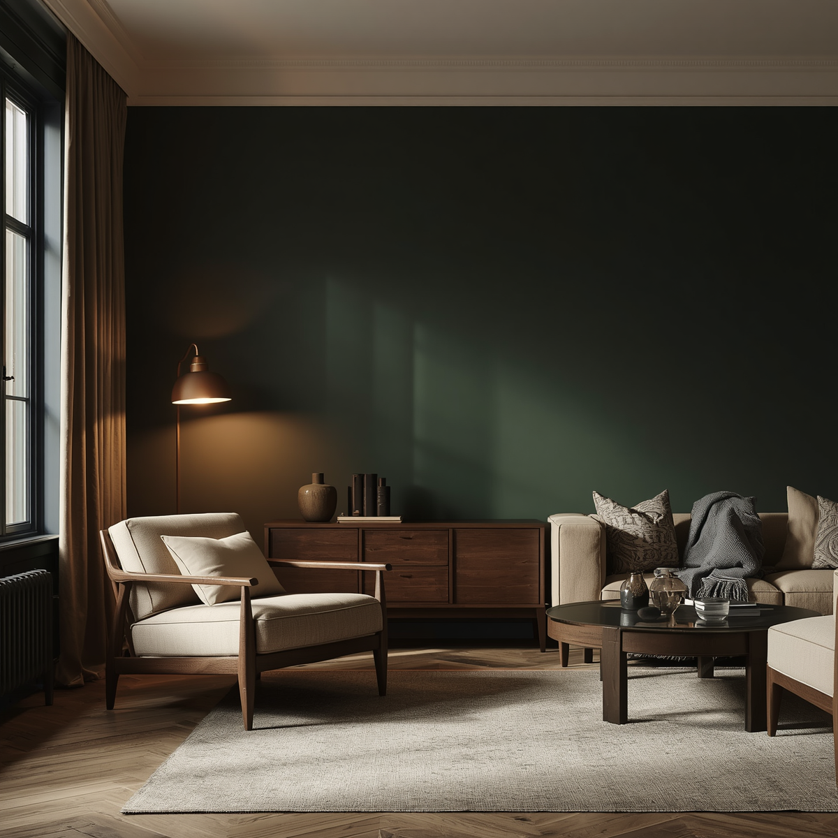
Don't be afraid of them. A deep, moody color on the right wall (a charcoal, a deep navy, a forest green) can make a space feel incredibly grounded and special. The key is doing it intentionally, with lighting to match.